Legion Health home and billing — Patient home and billing redesign for Legion Health
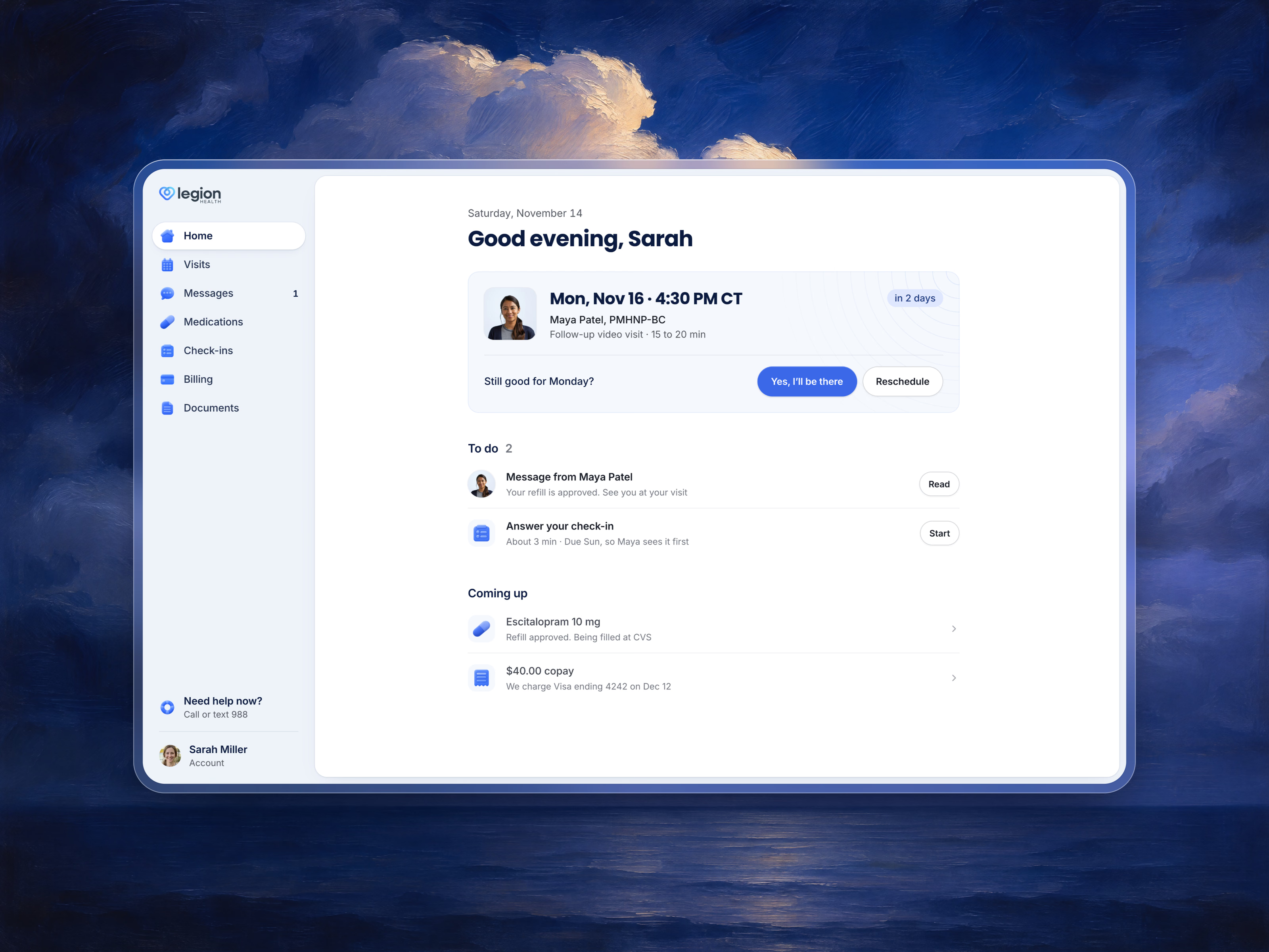
Home in Legion Health’s patient app, where adults in Texas see a psychiatric provider by video. The screen answers one question: what do I do next. The next visit sits on top with the one thing it needs, a yes that you’re coming. To do holds what waits on you, and Coming up holds what happens by itself, like a refill being filled and a copay charge. One centred column and one blue button, so nothing competes with the visit.
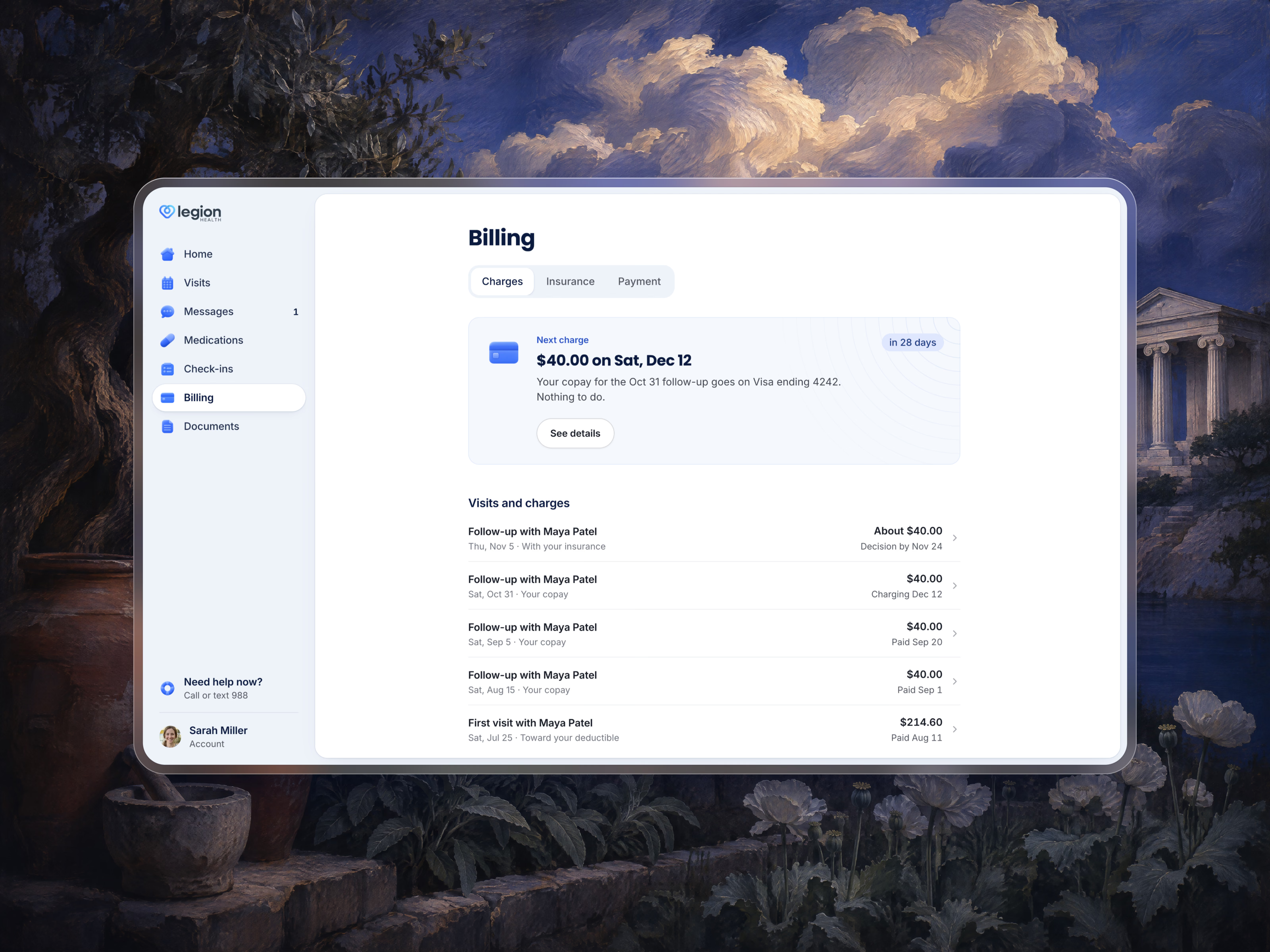
The second film is Billing, a bill that explains itself. It opens on the next charge: the amount, the day, the card it goes on, and Nothing to do. Under it every visit is one row that says where its money stands, from waiting on the insurer’s decision, to charging on a date, to paid.
Got something real to build?
Tell us what you’re building and let’s see if we’re a good fit.