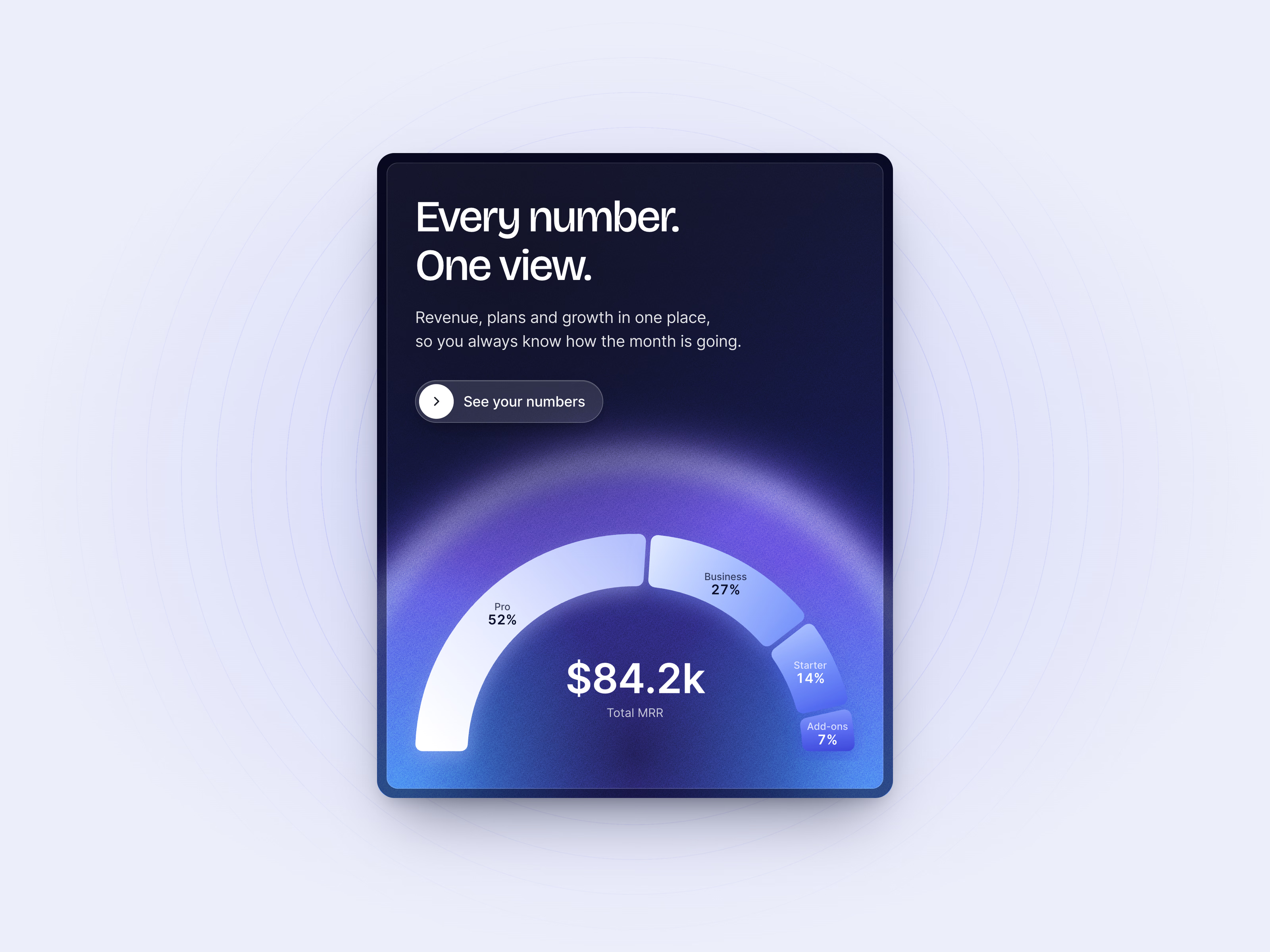
Revenue mix card — Animated revenue mix ring chart on a dark gradient card
Charts have been one of our favourite things since we started designing. They’re always good. We’re always looking for ways to show data to the user in an interactive manner so they enjoy it, depending, of course, on the tool they use.
This card shows revenue by plan as a half ring, one blue in four shades, and the total counts up to $84.2k. Next in the set is the busiest hours card.
Got something real to build?
Tell us what you’re building and let’s see if we’re a good fit.