Apollo.io Data Health
A small question about data quality became its own squad and feature. Then one design system for five squads.
Overview
Apollo.io is a sales platform. Max joined as a senior product designer and went on to lead its design system.
He picked up a small task about data quality, saw that it needed to be bigger, and turned it into the Data Health Center, with a product squad of its own. Then he brought the platform’s squads onto one design system: an audit, a token layer and a design champion in every squad.
- To ship the first version
- 1 month
- Squads on one design system
- 5
- Button variations found
- 47
Apollo.io is a sales platform: a database of people and companies, and the tools to reach them. Max joined in June 2021 as a senior product designer and later led the design system, in a team of three designers working across five squads.
Eugen designed Apollo’s growth experiments before him and helped hire him. That work is its own case study. This one covers what Max did next: a data-quality feature that became its own squad, then one design system for the whole platform.
A small question about data quality
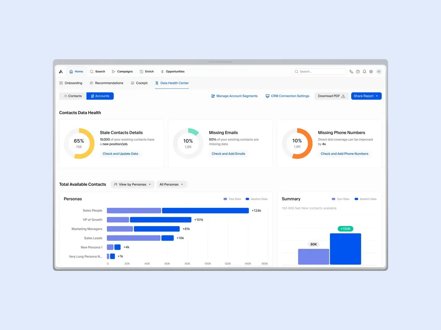
It started as a small task: a question about data quality. Max saw signs that it needed more than a fix, and prototyped fast. The first version shipped in a month.
The Data Health Center shows a team what is wrong with its contacts and accounts: people who have changed jobs, missing emails, missing phone numbers. Beside each problem sits the action that fixes it, and a view of how many new contacts Apollo’s own data could add.
From one task to a squad
The work grew into a standalone feature with a fully staffed product squad behind it. One trade-off kept it focused: a service outside the platform was left for later, and data quality on the platform came first.
The reported results: data accuracy up 18%, satisfaction up 12% and bounce rate down 16%.
Five squads, five design languages
Apollo had grown faster than its design. The platform looked like five products stitched together, because each squad had built its own patterns and components, and none of it was documented. Max’s audit found 47 button variations, 12 modal patterns and 8 ways to build a form field.
Governance first, components second
Max started with how decisions get made, not with components. He mapped what to keep, merge or remove, then built the token layer: colours, spacing, type and shadows. One designer in each squad became its design system champion and joined a weekly sync.
The team reported time to value down 35% and component adoption at 85% across the product. By month six every squad was between 78% and 92%. Six new designers were onboarded as the design team grew to three times its size.
Results
- To ship the first version
- 1 month
- From a small task about data quality to a feature of its own.
- Squads on one design system
- 5
- Each with a design champion and a weekly sync.
- Button variations found
- 47
- With 12 modal patterns and 8 form field styles, in the first audit.
Governance first. Components second.
Most design systems start with components. Max started with the process: who decides, how conflicts get settled, and how to tell if it is working. The weekly sync with a champion from each squad did more than any single component. A dedicated front-end engineer made it real in code.
Scope
- Data Health Center for contacts and accounts
- Component audit and consolidation map
- Token layer: colour, spacing, type and shadows
- Core component library
- Living documentation with code examples
- Monthly adoption tracking by squad